In this tutorial, we’ll guide you through using a UI Kit in Figma that you’ve downloaded from a marketplace, and how to make basic customizations to fit your project’s needs.
1. Introduction to Figma UI Kits
A Figma UI Kit is a collection of UI elements and design components like buttons, icons, forms, and navigation menus, packaged together for reuse. They provide a foundation that can be customized to accelerate the design process and maintain consistency across projects.
Benefits of Using UI Kits:
Time-saving: Quickly set up design projects without creating components from scratch.
Consistency: Maintain a cohesive look and feel across different parts of the project.
Quality: Leverage professionally designed elements to enhance the visual appeal of your work.
Where to Find UI Kits:
Figma Community: Free and paid UI Kits shared by other designers.
Design Marketplaces: Platforms like UI8, Creative Market, and Envato Elements.
Official Figma Resources: Templates and kits provided by Figma.
2. Downloading and Importing a UI Kit into Figma
Step-by-Step Guide
Purchase or Download a UI Kit:
Choose a UI Kit from a marketplace or Figma Community that suits your project needs.
Download the file, typically provided in
.figor.zipformat containing.figfiles and other resources.
Import the UI Kit into Figma:
Open Figma and go to your dashboard.
Click on the "Import File" button or drag and drop the
.figfile into Figma.
Access the Imported UI Kit:
Once imported, the UI Kit will appear in your Drafts or Projects section.
Click on the file to open the UI Kit and start exploring the components.
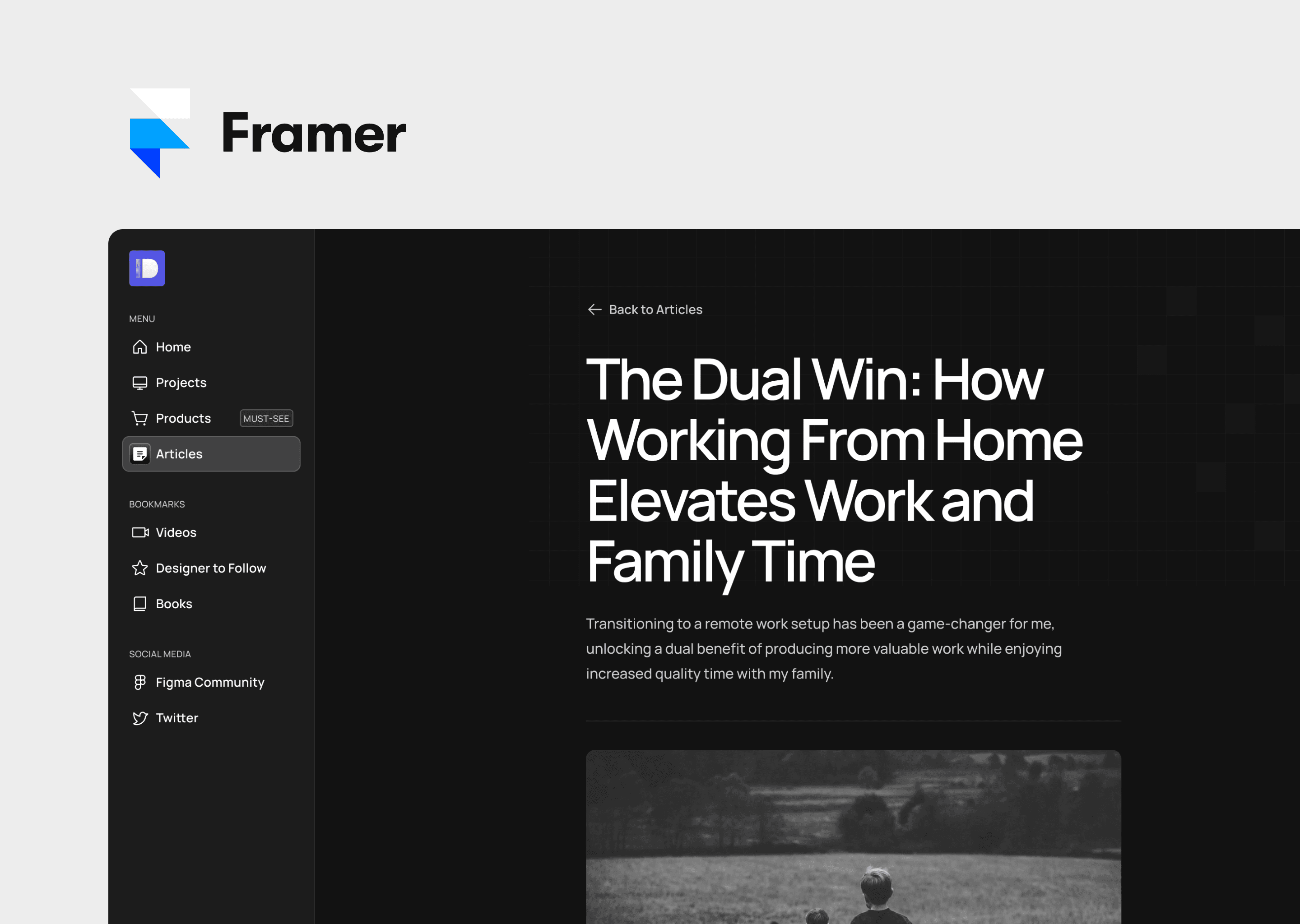
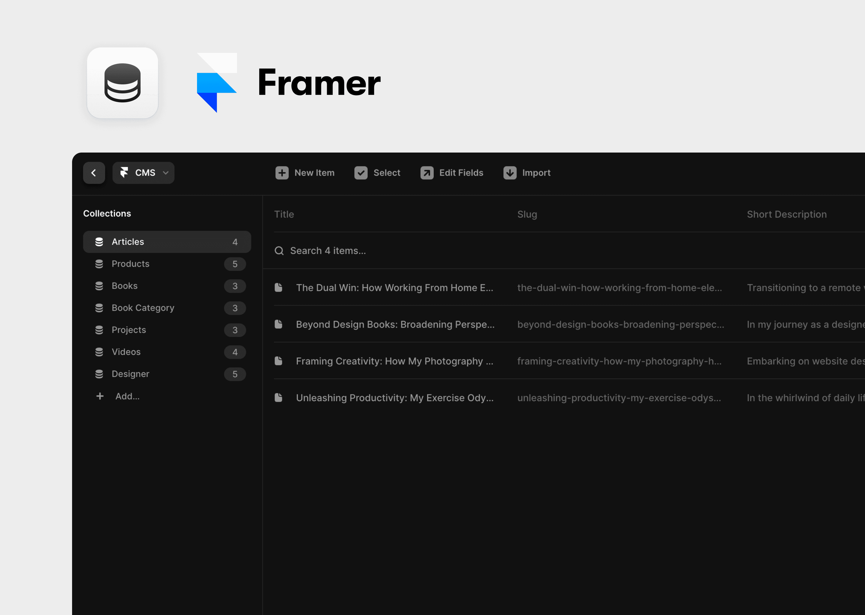
3. Exploring the UI Kit
Before diving into customization, it’s essential to understand what’s included in your UI Kit. Here’s how to explore its components:
Open the UI Kit File:
Double-click on the imported file to open it in Figma.
Examine Pages and Artboards:
UI Kits often organize components across multiple pages. Check the left sidebar for different pages like
Components,Icons,Screens, orStyles.
Inspect Components:
Click on various components to see how they are grouped and layered.
Familiarize yourself with the symbols and component names to streamline your workflow later.
Check for Variants:
Look for component variants, which are different states or styles of a component (e.g., button states: default, hover, active).
4. Customizing Components from the UI Kit
Once you’re familiar with the UI Kit, you can start customizing its components to match your project’s branding and requirements.
Changing Text
Select a Text Component:
Click on a text element within a component (e.g., a button label or heading).
Edit the Text:
Double-click on the text to enter edit mode.
Type in your new text and adjust the font, size, and style from the properties panel on the right.
Adjusting Colors
Select an Element to Recolor:
Click on the element whose color you want to change (e.g., button background, icon).
Open the Fill Settings:
In the right sidebar, under the "Fill" section, click on the color swatch to open the color picker.
Choose a New Color:
Select a new color from the color picker or enter a specific HEX/RGB value.
Adjust other properties like opacity as needed.
Modifying Layouts
Select the Component or Frame:
Click on the frame or component you want to resize or reposition.
Resize and Reposition:
Use the handles to resize the element. Hold
Shiftto maintain proportions.Drag to reposition the element within the canvas or use the alignment tools in the toolbar for precise positioning.
Modify Constraints and Auto Layout:
Check and adjust constraints in the right sidebar to ensure responsive resizing.
If the element uses Auto Layout, tweak its properties to control spacing, alignment, and padding.
5. Using Components in Your Project
After customizing your UI Kit, you can integrate its components into your design project.
Step-by-Step Guide
Copy Components to Your Project:
Select the component or group of elements you want to use.
Copy (
Cmd/Ctrl + C) and paste (Cmd/Ctrl + V) it into your project file.
Apply Custom Styles:
Use the customized components and apply any additional styles or adjustments to fit your project’s theme.
Create New Instances:
Drag components from the UI Kit file into your project to create new instances that inherit the master styles.
6. Best Practices for Customizing UI Kits
Maintain Original Structure: Try to keep the original grouping and naming conventions to ensure consistency and ease of updates.
Use Styles and Components: Leverage Figma’s styles and components to apply consistent changes across your project.
Document Changes: Keep notes on what customizations have been made, especially if you need to hand off the project to others.
Stay Organized: Create separate pages or frames for your customizations to keep the UI Kit and project files tidy.
Test Responsiveness: Ensure that customized components respond well to different screen sizes and orientations.
7. Conclusion
Using a Figma UI Kit from a marketplace can significantly speed up your design process and ensure a professional, consistent look for your project. By following this tutorial, you’ve learned how to import a UI Kit, explore its components, customize elements to fit your needs, and effectively integrate these components into your project. Whether you’re designing a website, app, or interface, Figma’s robust tools and the availability of high-quality UI Kits make it a versatile choice for designers of all levels.